CPC Reflection – RIMLP

My role in our small group was to “put everything together”. Our other team members would send me their information and I would put it into the Prezi, and then later on into the PowerPoint. Another role I played in the project was creating the introduction slides for our presentation. Introducing RIMLP as an organization as well as Geoff and his team.

Our subgroup wanted to achieve clarity. We wanted our small group presentation to set a clear guideline for when we came together in our super group. We tried to find the most cornet data possible as well as provide the most effective visuals. In the end, the super group used many different parts from our subgroup.

One main problem that we ran into overtime was trying to find time where everyone in our group could meet together. However, this issue is usually constant in all groups. Another problem we ran into was in the beginning on the project. When we first met with Geoff, we all thought that he was conveying information to us that we had prior knowledge about. After our first meeting with him, we had to decipher what he was saying to truly understand what he wanted us to include in our presentation.

When dealing with these issues, we usually talked about them as a group. Everyone included his or her insight on the problem and together we came to a conclusion.

If we had more time or resources, I think it would have been nice to put together a more visually pleasing presentation. We only had a little more than 1 week to work in our super groups, and I think that it showed in our final product. I thought that presentations looked good, but with a little more time and resources we could have made them that much better.

Our first slide was introducing the RIMLP organization and information about them as well as who Geoff and his team are. It was a very simple slide, yet very important in making a clear statement about the history of RIMLP.

Our second slide was about the objectives of RIMLP and what RIMLP will bring to its investors. This slide contained more cornet information, lacking in visuals to convey the message. I think that it was important that this slide consisted solely on words because it was the main purpose behind the presentation.

This slide showed a large visual of how many medical legal partnerships there are nationwide. Geoff really enjoyed this slide, and the next slide, because they provided a great info graphic showing how many MLP’s there are in each state.

The next slide showed a similar info graphic on hospitals supporting MLP’s nationwide. Again, Geoff endorsed this slide because it was a great way for his investors to see where other states stand on supporting MLP’s.

This slide consisted mainly of one large info graphic showing how many clients Geoff helps per year, and the amount each client brings in reimbursements to the host health care provider. Our subgroup created this visual, and we decided that instead of Geoff just telling his audience about his clients he could visually show it in a much more appealing way.

The next slide was the “numbers” slide. Included was a large table showing how successful investors could be if they decided to partner with RIMLP.

Slide 7 showed two different individuals. This gave Geoff an opportunity to give testimonials about his clients. This was a good way to evoke emotion from his audience, and help convince them to invest.

Our final slide was a wrap up of what is needed from investors, and the repetition of what RIMLP plans on doing.

The three most academic things I learned from this project were about different types of visual representation tools in presenting, how to work with an actual real life client, and how to make a presentation visually pleasing to an audience.

I think the best part about working on this project was that it actually was making a different. We were helping not only Geoff and his organization, but the people of Rhode Island as well. Even though we may not see the impact that we have made, knowing that we had a part in making a difference is the best part in my opinion.

The worst part about working on this project was trying to understand all the in’s and out’s of Geoff’s business and what he was trying to accomplish. Eventually it all came together and allowed the construction of the presentation to flow much easier.

The one professional skill that I learned from this project was how to make a presentation visually pleasing. I learned what colors to use and not to use, where things should be placed, and how an audience looks at a presentation. These skills I have learned will help me in my future presentations.

I think I am most proud of actually making a difference in someone else’s life. In normal classes we are usually only working to benefit ourselves, but in this class we helped many different people with our hard work one the semester.
 

Visual Resume

Image


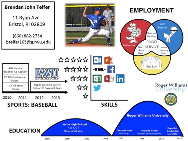
Ironically enough, the day before this assignment was assigned I had a meeting at the Career Center to tighten up my actual resume for upcoming internship opportunities. A visual resume was something that I had never heard of before, but after understanding the basics it was easy to decide what parts of my resume I was going to include in a visual way. Unlike my actual written resume, for the visual resume I had to put on a different lens and look at all the words that filled up the page in a different way. As we have been learning in class as well as with out CPC project, the visuals we made usually consist of qualitative data. Looking over my resume, it was hard to see where I would find these numbers for my visuals. Since I was no expert on visual resumes, I went to the web and looked up examples of visual resumes. One of the things I found the most interesting about these examples was that they were all unique in their own way. The resumes we are taught to create have a very strict format. A visual resume lets you be yourself and express that in anyway your mind can put it together with images. Looking at all the examples in front of me was a bit overwhelming, not one having something exactly the same as any others. However, as scrolling through a few that caught my eye, I began to visual my information in visual form.

I began with my skill set. I looked over everything that I had listed on my resume as decided that they could be separated by my strength level in those skills. I used a ranking system, 5 stars being my highest strengths and 1 being my lowest. I found small images representing the icons of the skills and placed them accordingly next to the star that had the right equivalence. This allowed me to showcase my skills in an ordered visual fashion that was easy to comprehend.

Another visual that I enjoyed creating was about my employment. My first official job was in food services, and my most recent job was as well. I wanted to show in my visual that my work experience was related and that I have worked in many different positions in food services over the years. I began with a Venn diagram, placing what linked all my jobs in the center, which is food service. I then used each circle to show what position I had at the three different places I have worked.

The last visual I used was a timeline for both my history in baseball as well ad education. I used the timeline for baseball by placing my achievements on the line according to the year they happened. For education, I listed my high school and the university I attend, as well as when I declared my major and minor.

I had trouble finishing my visual resume because I did not want to stop. I got lost in the visuals and the details, trying to make them as clear, simple, and concrete as possible. Unfortunately, I can only fit so much on a page and I was running out of information to create visuals for. As I gain more experience in the future, I look forwards to adding on to my visual resume.

Simple Tables to Graphs

Screen Shot 2013-11-19 at 2.36.48 PM

Through this assignment, I’ve learned that conveying the information of numbers through a simple table is not the most effective way the majority of the time. Today, we had our group presentations for Geoff, and as expected everyone incorporated some type of “info graphic” whether in Prezi or PowerPoint. The most interesting part was seeing how other groups interpreted the data and how they choose to portray it. Geoff was a fan to say the least. Plain numbers can bore and audience to the point where they have no interest in what they mean. However, by using an info graphic it changes everything.

I searched through the Roger Williams webpage for some sort of relevant data. I decided to use the information about students at our university. After creating a simple table, I used Excel to create the two generic graphs and charts, one being a bar graph and the other a pie chart. While the graph and chart successfully tell the story of the numbers, it seems that even these graphs and charts we make today have almost turned into the numbers we are use to seeing. In other words, we have become numb to seeing data presented as plain numbers, and now we have seen so many graphs and charts we are becoming numb to these as well.

In my marketing advertising class, we are learning how to create a successful advertisement in the most effective way possible. One of the main facets of an effective advertisement is that it tells a story. Tables, graphs, and charts tell a story, but not in an exciting way to say the least. For the info graphic that I used, it has the ability to convey a story to everyone, however they want to interpret the data. Another facet is being unexpected. This is what I think relates most to the info graphics. When a slide pops up for a presentation and you see a plain graph, nothing is exciting about it to grab your attention. On the other hand, when an info graphic pops up, it catches your eye and you try and decipher the meaning of it. By being unexpected it creates a stronger memory in our minds, we are more apt to remember that info graphic and the information it provided.

Looking at all of the visual representations of data that I created, someone might say, so what, they all say the same thing in the end. I think of it this way, if I was an student on a tour of Roger Williams and I have visited many schools already, I would not think that something unexpected would show up in the brochure that is handed out. When I open it up, I see something that makes Roger Williams different from everyone else, and info graphic representing the amount and students as well as what their role is at this school.

Going forward, I think that using info graphics to convey data should always be considered first before using the generic visuals that we are used to using. 

“How-to” Graphic: Rice Krispy Treats

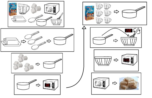
Trying to create this “How-to” graphic on making Rice Krispy Treats was a lot more difficult than I thought it would be. First, I had to look up the directions on how to make the treats before starting anything, since I have never made them myself. After reading up on Rice Krispy’s 101, I went straight to the pen and paper. I wrote a list of all of the ingredients and appliances needed. Next to each item on the list, I “attempted” to draw it as best as I could. I soon began to realize that my drawings were not the best, and also that drawing these images over and over would be a tedious task. Back to the computer I went, and opened the program “Paint”, something that I had become very familiar with when I was younger fooling around on the home computer. Remembering that no words can be used, I found the most generic pictures of each item on my list and began making the directions. I began to challenge myself by trying to make the directions as detailed yet clear as possible. I would catch myself at times putting down an image and moving on to the next step, however, the image on the page made sense in my head but would not make sense to someone who does not know how to make the treats.

I began with the ingredients and appliances step, including a picture of each in the box. Running into my first issue began with the second step. The recipe called for 3 tablespoons of butter. Without being able to use words, I thought the best way to convey this step would be to have 3 spoons next to the butter indicating that the recipe called for 3 spoons of butter.

After completing my directions of 8 steps, I put it to the test. I asked a few people to look over my directions and see if they could follow them and would be able to make the Rice Krispy Treats based on what I had given them. This might have been an unfair test, since all my roommates not only understand English but did not want to be bothered by my attempt to involve them.

Looking back on making the “How-to” graphic it made me realize how easy and helpful these types of directions can be. Not only for people who speak different languages, but also for people who may not understand the terminology being used in normal descriptive directions. For example, someone reading directions on how to put a computer together may not understand where something as simple as where the USB cord can be plugged in. However, with a simple image and graphic of the USB symbol, anyone would be able to figure it out. This also goes to show how symbols and images can be more useful than words. This is something that we will need to keep in mind while we are creating our presentation for Geoff.

Flowcharts

flowchart

For the past few classes we have been talking about flow charts and how they help lay out a decision process. For this blog we had to take a new customer using Amazon.com to buy a new book. While it seemed that many people we familiar with using flowcharts in class, this was the first time I was ever exposed to them. In class we practiced flowcharts with an exercise in our groups. I took a step back when we tackled this exercise and observed what the other members of my group had to say and how they went about creating this flowchart. By then end, and after some constructive criticism from Professor O’Connell, I knew I would be ready to start the Amazon flowchart.

Believe it or not, I have never used Amazon to buy something … well maybe once, but I had no memory of it. So, in order to know how to do start this flowchart, I went straight to the source, Amazon.com. I acted as if I was the “new user”, and created an account. With a piece of paper at my side, I wrote down everything I looked at or clicked on. Searching for the most recent book I have read, it was as easy of a checkout as any other website that I have used. I used the “decision” shape for the one major question that must be answered before any purchase someone makes online; did you pick the right product? If you have done so, then you simply follow the steps to complete your order. However, if it’s not the right product, then you simply start from one of the pervious steps.

After a few rough drafts and a couple mistakes, the final flowchart was finished. I remember when I first saw a flow chart in class and how I had no idea what all of the different shapes meant. Now looking at my flowchart, instead of seeing a busy sheet with words and shapes, it all makes sense.

This assignment reminded me a lot about the map mind blog post we did earlier in the semester. I remember how after finishing the mind map it helped me organize all of the ideas and thoughts in my head. Even though the principles behind mind maps are different from flowcharts, the still seem to accomplish the same thing in my opinion; organize. This is the one of my biggest problems is that I find myself overwhelmed with the amount of things I had to do in one day. A flowchart gives you a simple step-by-step visual of how to get through all of these activities, while the mind maps made me think about everything I had to do through a different lens.

Going forward, I can see myself using these flowcharts in many different ways. Whether that is with helping something follow a set of directions or even mapping out how to get a project done. Being a visual learner myself, flowcharts are made for me in that they help me retain the information much easier.

Rhode Island Medical Legal Partnership Storyboard

Image

After creating the storyboard for the beginning stages of our presentation, I was able to get more of a visual grasp on things. Starting the storyboard was easy, the basics. An introduction with all of the primary information included, such as the presenters name and organization. I tackled this storyboard the same way I would with any presentation. I wrote down all my ideas on paper and then categorized them. Even though this presentation has much more value than a simple PowerPoint presented on a class project, the same basic ideas still apply in my opinion.

Geoff has to present a very serious topic to a very serious group of clients. Since I am not the one presenting the material so I had to think outside of the box and put myself in Geoff’s shoes. Knowing that Mr. Schoos is trying to convince his clients to partner up with him, I thought that a strong argument would be comparing what he has to offer to what is offered currently. My main concern going into this storyboard was that I did not know a lot of key information about his business and what the main issues are. However, I took a different approach to everything by making my storyboard more of a broad outline for the presentation. This way, once I know all the information that is necessary I can fill it in with the corresponding part in the outline.

A key part that I wanted to make sure was included was that the presentation conveyed a certain type of emotion. I really strong way to get the clients to be more inclined to become a partner is by tapping into their emotions. This subject is a very serious issue. Nobody wants people to suffer from illness or inadequate care. By incorporating real life stories about real Rhode Island citizens can be a great way to convince the clients.

Another very important part of the presentation is to prove to the clients why future healthcare will be better by partnering with Geoff. Even though I don’t know the full details on how it will be better, I know that this slide will be essential in the success of this presentation. The benefits of better healthcare are obvious but how you get there is much more important.

Geoff has limited time with his clients and needs to be able to quickly share his message while also leaving plenty of time for questions. The presentation needs to give a strong representation of the plan but also needs to leave the audience with enough knowledge to ask beneficial questions. I think that this will be a great time for Geoff to prove his points. He seems to have a great sense of humor and is very personable. By having plenty of time to answer questions he will be able to interact with the clients on a different more appealing level, rather than just regurgitating information off of a presentation.

A lot of work still needs to be done in order to create a great presentation for Geoff, however I think our group is heading in the right direction to fulfill our request.

Rhode Island Medical Legal Partnership Project

Our group project … where to begin. I am in the group covering the Rhode Island Medical Legal Partnership, and meeting with Mr. Geoff Schoos was very interesting. However, before our meeting, I had mixed feelings on how this was going to work out in the end. So many questions were running through my heads, but I needed to focus in and learn as much as I could from Mr. Schoos while we had him in our presence. Before going into the breakout room with Mr. Schoos, we delegated each member of our group a certain question to ask about the project. After looking over the question sheet, we realized that we did not want to make Mr. Schoos repeat himself by asking questions that may cover multiple topics. On the fly, we fixed this issue and were ready for what he had to share with us.

It seemed that as soon as I sat down the meeting was over, it went by so quickly and so much information was presented during those 30 minutes. My overall impression of the meeting was positive, however, some gaps still need to be filled in. Before going into a project, I need to know everything possible in order to cover all aspects of the issue at hand. It seemed to me that Mr. Schoos might have thought that our group already had some sort of prior knowledge about the project beforehand. Once we asked the first question he began to elaborate and venture off into other side, more complicated topics. Following Mr. Schoos was difficult at times, and as a group we need a strong foundation in order to successfully create something of value for our client.

Personally, I am a visual learner. In order for me to understand Mr. Schoos’s business and what his overall goals are I need to see them written down. When Professor O’Connell wrote on the board the difference between his audience and clients, it helped me greatly in understanding what Mr. Schoos was talking about when we asked him who is audience actually was. Prior to our meeting I imagined this presentation being presented to his customers not his clients. It may seem like a very minor detail, but in the end it has an enormous significance.

It was great to hear that Mr. Schoos was opened to different forms over visual communication, rather than just using PowerPoint. We seem to have a couple people in our group that is comfortable using different tools to present the information. He seemed excited about the idea and encouraged us to push forward with that. Another part of the meeting that I found interesting was the fact that he does not have a logo for his company. He left that as a task for us to accomplish as well. He seemed to have a very opened mind about this project, even though it was covering a very serious topic for his company. I think that this opportunity is great for all of us, and working for someone like Mr. Schoos makes this experience easy and that much more enjoyable. 

5 Photos

Image

Image

Image

Image

Image

Starting this assignment was a bit intimidating at first. Taking five photos of the environment, I never thought of myself as a photographer at any point in my life. I began snapping random pictures of the everyday things that surrounded me. After scrolling through the snapshots I realized that these images has no relevance to the overall topic I was trying to accomplish. Nevertheless, just like in the Mind Map assignment, it all came to me at once…

Baseball Only:

I took this picture when I was walking down the street from my house. At the baseball field in the center of Bristol was a fallen sign with the words “Baseball Only”. With the small gridline fencing in the background, the distinct lines of the sign stand out. The color also plays a large role in this picture. The faded colors of the fall grass and the weathered pavement are looked past with the bold solid green sign.

Beach Front House:

While taking advantage of living in downtown Bristol, I was on a run along the beach when I ran past this modern looking beach front house. Unlike other houses in the area, the lines of this house stood out to me the most because of it’s simplicity and symmetry. When looking at this picture, my eyes follow the steps leading up from the beach then move upward from the long window at the bottom to the sharp tip of the roof. Something that I didn’t notice when I took the picture was the back part of the house, which shows symmetry as well as depth.

Dumpster:

While at the gas station, I was looking around while pumping gas. Lurking around the corner was a vibrant yellow dumpster. I can only imagine what everyone was thinking when they saw me taking a picture of this. It caught my eye first off because of its placement. It was hidden behind a dark blue dumpster, also because the color yellow on a dumpster was something I have never seen. The texture was interesting as well. The rust where the dump truck picks it up gave the picture a rugged and rough feeling.

Stella Artois:

When I was out to dinner this weekend, I was sitting back in my chair and the glass sitting in front of my caught my eye. The elegant shape of the glass outlines a dull golden looking liquid, which is also accented by the golden rim on the top of the glass. However, the stylish look of the glass is overshadowed by the bright red colored logo “Stella Artois”.

Sunset:

While I was out to dinner this weekend with my family, I was enough the last few days of great weather before the chilling fall temperatures came upon us. The sun was setting and I couldn’t help myself from taking this picture. The colors in the sky were amazing. Focusing on the brightest portion of the sky, my eyes ran across the skyline and into the vast bay water, which was drenched in the beautiful pink and orange reflection from the sky.

My favorite part of this assignment was the fact that throughout one day I was able to take a snapshot of the things that I had done; a way to document my day. Starting with my walk past the baseball field, to running along the beach. Then filling up my car with gas to get to dinner with my family.

Mind Map

First Draft:

Image

Final Draft:

Image


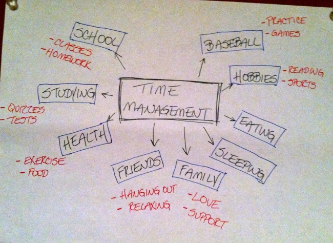
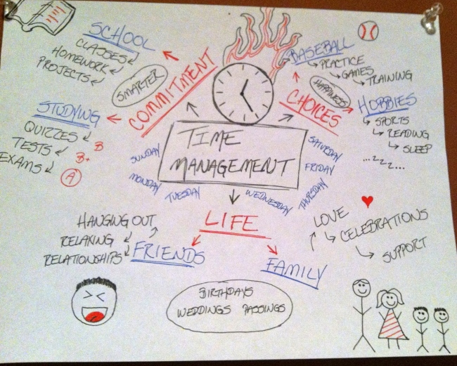
Mind map, something I have never heard of before. Tackling this assignment was different from anything I have ever done here at Roger Williams. Expressing my thoughts on an issue, letting those thoughts flow freely onto the page without judgment. I began thinking about what everyday issues I struggle with, whether I can control it or not. After a couple minutes of drawing blanks, I realized that I had a quiz due online in a different class that I had to finish before I went to baseball practice. Then it hit me, time management. Trying to juggle all of the choices and commitments I have everyday. How do I stay on top of everything? That’s when the thoughts started to flow as I scratched my ideas onto paper. To be honest, I thought that my first draft of my mind map was completely wrong. I reminded myself that it had to judgment free, something that might only make sense to myself. Starting with the obvious time consuming things I do everyday: school, studying, baseball, I hit another roadblock when I did not know where to go from there. I stepped back and took time to think about why time management is such a big problem for me. I began to break down all of the sub topics I had under the overall theme. I recognized three major themes of my sub topics. I have a commitment to school and studying for my classes. I have made the choice to play baseball and take time for my hobbies, and friends and family are a part of life. This is when I hit fifth gear, the connections started to come together in my head.   The choices are the things in life that bring me happiness. Even though friends and family do as well, my choices always allow me to leave everything else that is going on behind while I indulge myself in baseball or my hobbies. The commitments I have are a positive influence on my life. Going to school and studying will allow me to graduate and ultimately help me become employed. This leads back to my overall happiness that I gain in the choices I make. Looking back on my mind map I realized that even though I may see baseball and studying as two very different things, they are connected in some way, as is everything I wrote down. By letting my thoughts flow freely into this unique assignment, it was a great way for me to understand what I spend my time doing and how many activities take up time during everyday. Going forward, I now have a visual of everything that I need to focus on. The reason time management has been such an issue for me is because everyday I just go through the motions, without realizing all of the things that I do. Now I have a map in my mind, over viewing everything. Hopefully, I can now be more organized and successful in managing my time.